First of all, for those who do not know, XHamster (also known as Hamster X ), is a website that has pornographic content and was founded in 2007, with headquarters in Limassol. Since then they have not stopped growing and in November 2015 they were already number 72 in the list of websites with the highest world ranking. With its more than 20 million active users, it overtook popular porn sites such as Pornhub and Xvideos. Is this just because of its content? Or does it also have a lot to do with the marketing and graphic design applied by the company?
The answer is very simple, its success is due to the set of all its virtues but nevertheless in design and marketing of the web has had much to do…
Marketing behind the brand:
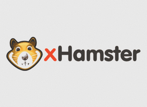
Alexander Hawkins, xHamster Marketing Director explained that they were looking for an animal that was fun, friendly and catchy. As a result of some preliminary work, they chose three animals: a mole, a fox and a frog. However, in the end the team chose a hamster. These animals are funny and adorable, cute, soft and with a sexual energy like no other.
On the other hand the brand logo has suffered subtle but important modifications, although the teeth used to be quite big in the original logo, it is being given more prominence with the current logo. Making the current logo much better understood and there is no doubt that we are in front of an adorable hamster… one that loves to fuck!
As for the typography, the letters have become much more legible, simple and neutral from an emotional point of view. They left the “X” in red in order to create a kind of visual link between the old and the new logo.

XHamster is undoubtedly one of the leaders in the category of adult content websites, and with a large community of users. It has taken on a slightly new identity, but retains its essence with the hamster, while eliminating the noise, the unnecessary. The final result is a much more attractive logo.